This is going to be the new File Explorer for Windows? I am definitely not a fan

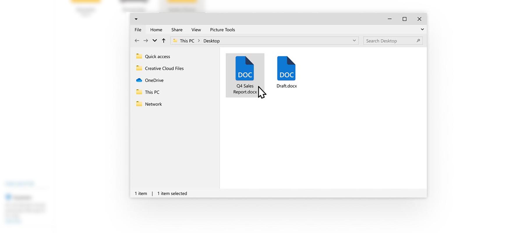
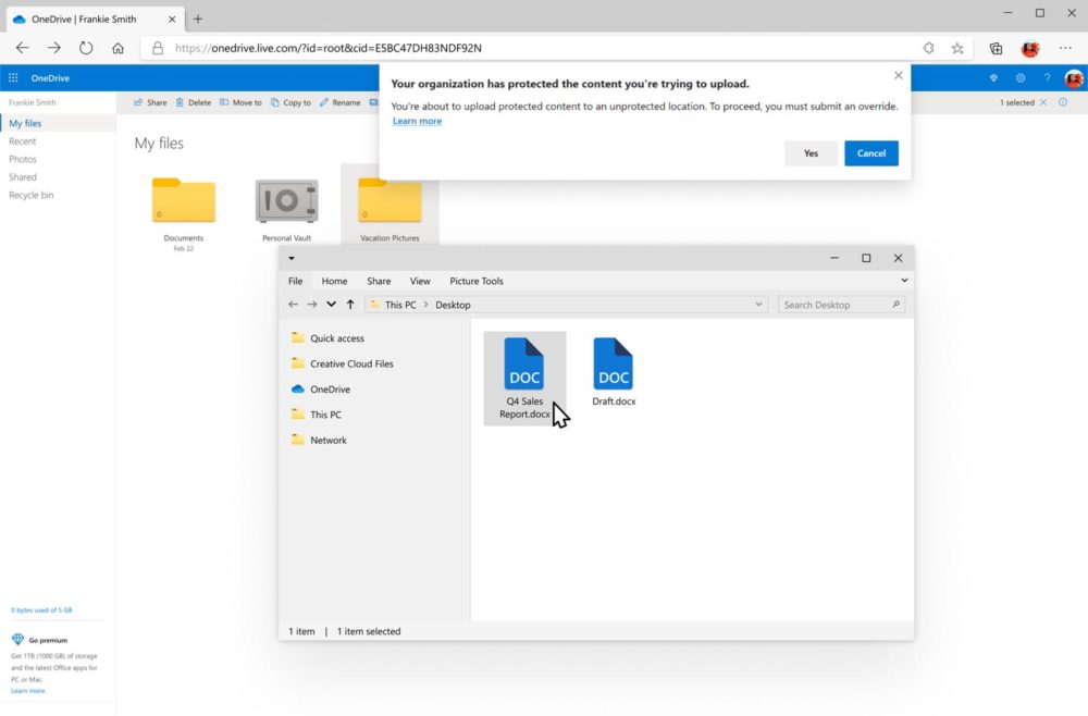
On one of the pictures presenting new features in the Edge browser, Microsoft has placed a File Explorer with an appearance unheard of in any version of Windows. Aesthetically, everything is correct, but this time it is probably not the case.
File Explorer is one of the most important Windows tools and is usually highly appreciated by Microsoft users. It does not meet the needs and expectations of everyone - the readers will surely give me a hard time in the comments, convincing me of the superiority of Total Commander or Finder - but for the vast majority of them it seems to be a tool close to perfection.

The best proof of this is how reluctantly any changes are accepted by its users. In fact, the last significant novelty was the ribbon-based interface introduced many years ago. However, this maturity has a side effect: as everything evolves, adapting to changes in the environment becomes a particular challenge.
Microsoft has repeatedly researched the ground, showing in passing various mockups of the new Explorer - both in the times of Windows 8 and Windows 10. Each time being sent to the drawing board. I hope this project will develop before it hits the system.
Windows 10 with the new simplified File Explorer. Well, simplified ...

The above screen shot appeared in a blog post about What's New for Edge. So that for the second time, Microsoft nonchalantly and casually throws something new somewhere completely unrelated to it, and then waits for a reaction. My first? Instinctive no But also certainly due to the fact that I've been used to the current version of File Explorer for decades. Is it just that? After all, it is stylistically more suited to Windows 10, right?
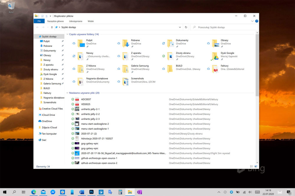
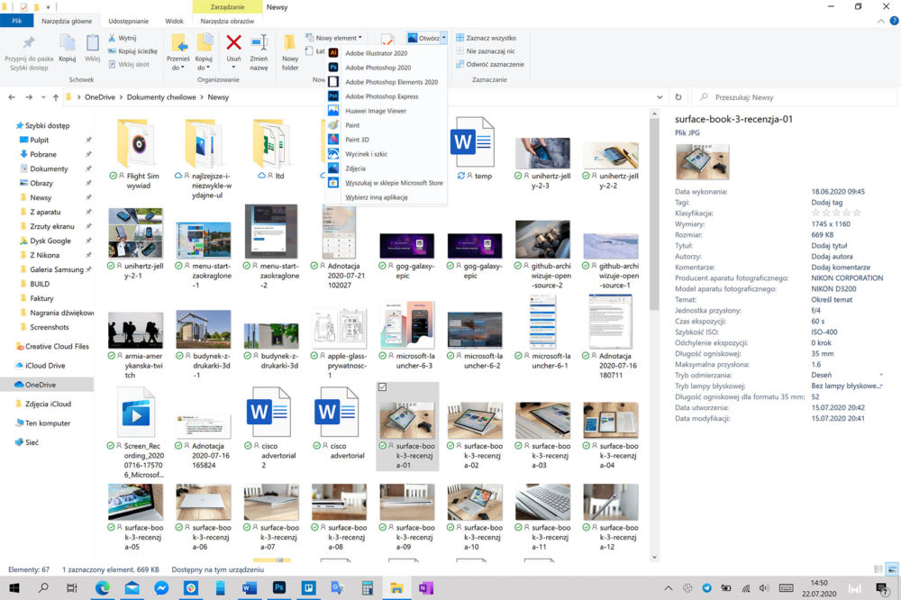
The problem is that, in my opinion, the greatest advantage of File Explorer in the current version is the perfect compromise between readability and the multitude of functions within the cursor's range. The interface dynamically adjusting to the context has been refined to perfection over the last decades - and it still allows you to display content in different views and modes, depending on your preferences.
Meanwhile, the above design seems too dense and compact. Previously available functions are immediately hidden in a sub-menu and require more clicks or finger taps. This approach works great in Office mobile applications displayed on small screens, not in a desktop tool.

As a consolation, this is just another project, which probably - like all the previous ones - will end up in the trash. I can't speak for you, but as far as I am concerned, I don't miss File Explorer unifying with the rest of the system. Yes, it looks objectively like a hat piece. However, it works great.
This is going to be the new File Explorer for Windows? I am definitely not a fan
Such a nice post.#Thanks for sharing this kind of information total-commander-crack You can also visit my Website ukcrack.com
ReplyDeleteIt is the best website for all of us. It provides all types of software and apps which
ReplyDeletewe need. you can visit this website.
spyhunter-crack
sotal-commander-crack
Thanks for sharing your knowledge to install & crack the Time Tables, but you need to update
ReplyDeleteit now. because there is a 2022 version available now:
otal-commander-crack
utorrent-pro
am-broadcaster-pro
movavi-screen-capture-studio
hotspot-shield-elite
Very interesting to read this article.I would like to thank you for the efforts you had made for writing this awesome article. Thank you very much, this is really a large amount of information content-rich articles, I am glad that the author could get out to share with you It is very useful. Try to keep on posting these kind of things. Thanks for sharing. download Total Commander
ReplyDelete